There are some basic rules and design terms you need to know before you dive into typography. Here are the most important ones:
Style
Letters come in many many different shapes and styles. Categorizing them can be challenging as there are many factors to take into consideration: their looks, the inspiration for them, the era they appeared in, and their usage. For the sake of simplicity, we often refer to three major style categories and then split those into smaller ones.
Serif
The first serif typefaces were inspired by traditional calligraphy, and are called Humanist or Old Style. This style is characterized by smooth and rounded forms and slight weight variations.
Around the mid-18th century a new type of serif emerged, which we now call Transitional. This style marks the transition between the Humanist and Modern styles, so it combines a little of both styles’ characteristics.

By the late 18th and early 19th centuries, a mode radical serif style was born: the Modern. We can recognize this style by the sharp weight contrast and the thin, straight serifs.

With the rise of advertising in the 19th century, Egyptian or Slab Serifs were introduced. Thanks to their bold appearance and heavy serifs, they were the preferred style for displaying commercial messages.

Sans Serif
Sans serif typefaces became popular in the 20th century, and they also had a calligraphic influence, so we call them Humanist as well. We can observe a slight weight variation and an overall warm vibe.

In the mid 1900s Helvetica was created, setting the bar for Transitional sans serifs. These letters are uniform and more rigid than the previously used ones, lacking the hand crafted element.

Geometric sans serifs are the equivalent of Modern serifs. They are built on geometric forms (the letter O is a perfect circle) and the peaks of letters like A or N are sharp and strong.

Cursive
Script letters imitate handwritten and calligraphic styles and they can be anywhere from sleek and formal to messy and effortless.

Brush faces are close to Scripts, but they draw inspiration from brush lettering. This makes them bolder and less elegant.

Finally, the Gothic or Blackletter style has traditional felt tip calligraphy at their base. The style is developed from Carolingian minuscule, and by the mid-12th century a new style was created with sharp, straight and angular lines.

Font vs. typeface
I’m certain we’ve all been confused at some point in life about the difference between a font and a typeface. I definitely was!
A typeface (or a font family) is the visual design of the letterforms and it consists of multiple font formats. In metal typesetting, a set of physical letters is considered a font, containing every existing letter, numeral and punctuation mark as a separate element. In the digital world, the font is the software we install and use.
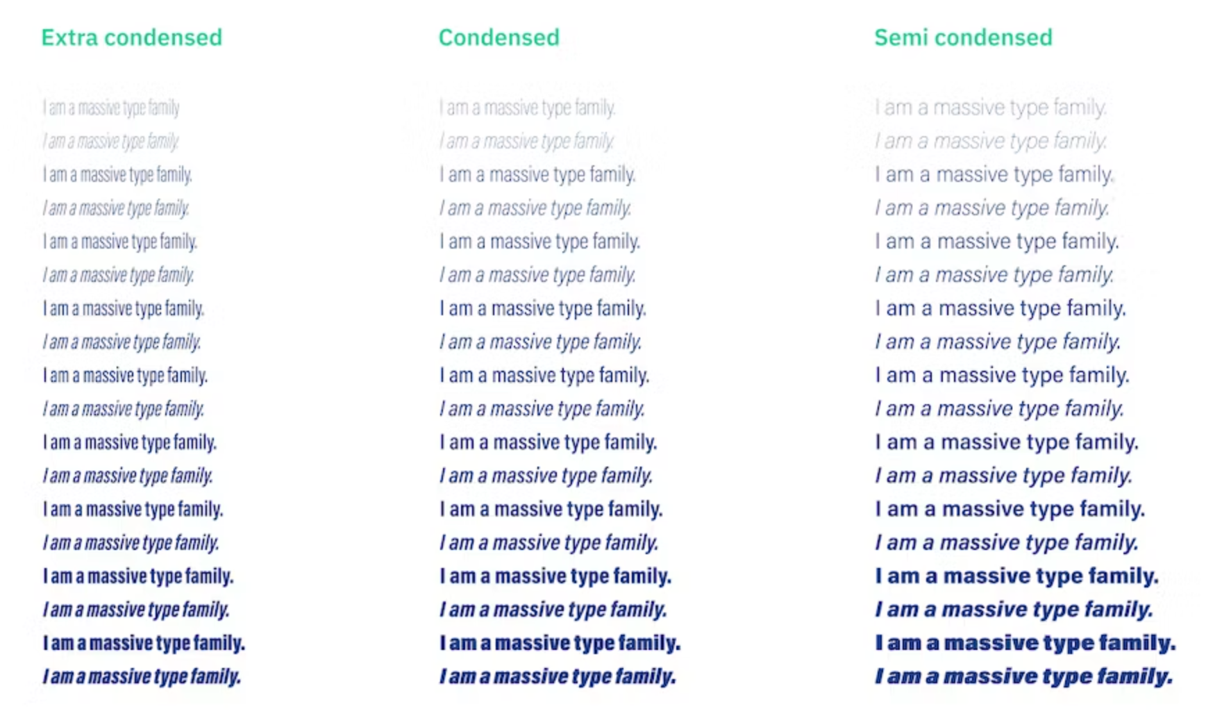
A full font family can have an overwhelming amount of styles: from super thin to ultra black and from extra condensed to super wide, all in regular and italic.

But wait, that’s not all. Some faces also have small caps (uppercase letters that only extend to the x-height), lining numerals and non-lining numerals (numbers that extend beyond the baseline and x-height, integrating more seamlessly into blocks of text) and in some cases even a few extra alternate characters. That’s quite a lot, huh?