Color theory is both the science and art of using color. It explains how humans perceive color; and the visual effects of how colors mix, match, or contrast with each other. Color theory also involves the messages that colors communicate, and the methods used to replicate color.
In color theory, colors are organized on a color wheel and grouped into 3 categories: Primary Colors, Secondary Colors, and Tertiary Colors.
What is Color?
Color is perception. Our eyes see something (the sky, for example), and data sent from our eyes to our brains tells us it’s a certain color (blue). Objects reflect light in different combinations of wavelengths. Our brains pick up on those wavelength combinations and translate them into the phenomenon we call color.
The Color Wheel
The first color wheel was designed by Sir Isaac Newton in 1666.
Artists and designers still use it to develop color schemes, color harmonies, mixing, and palettes.
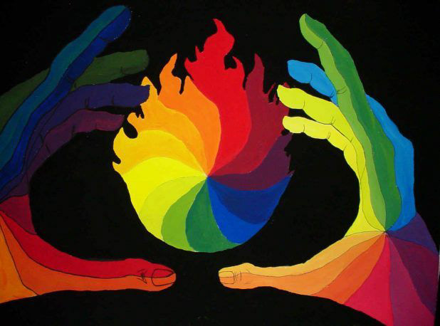
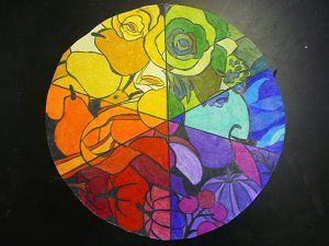
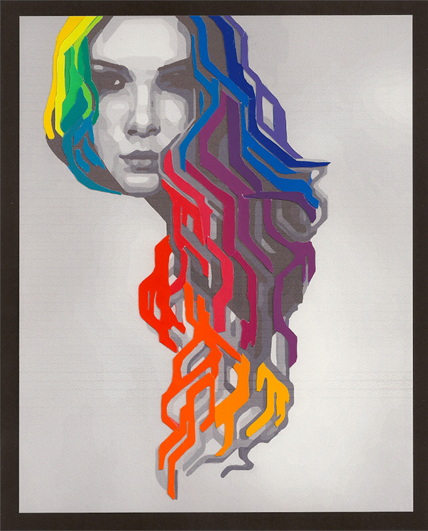
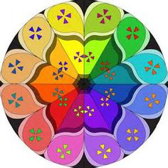
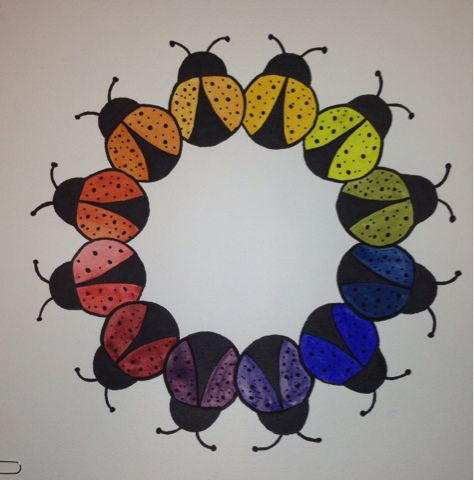
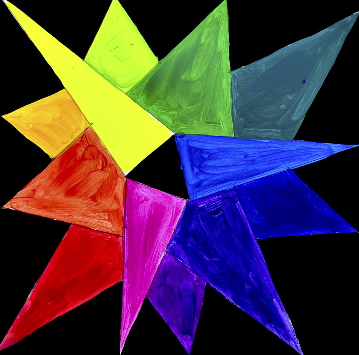
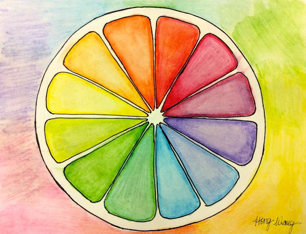
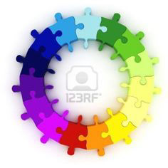
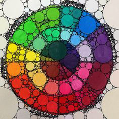
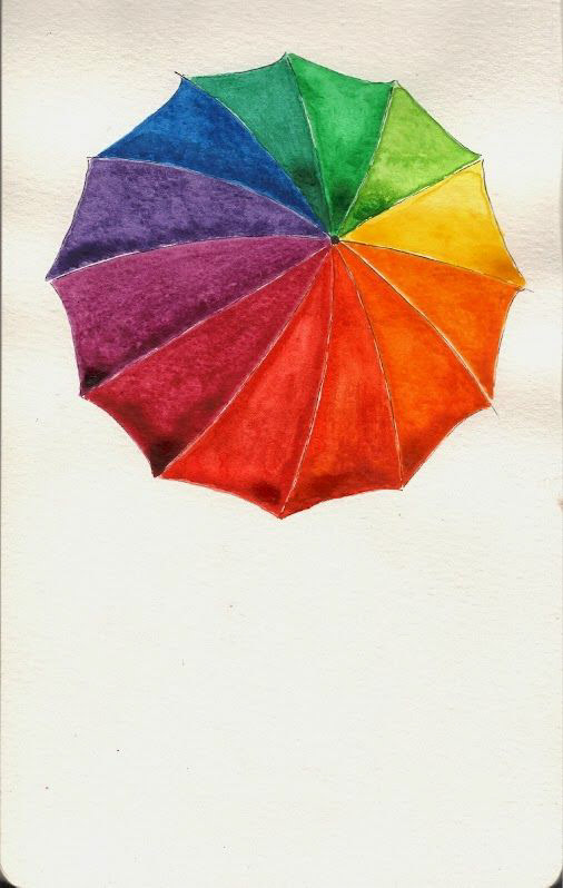
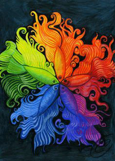
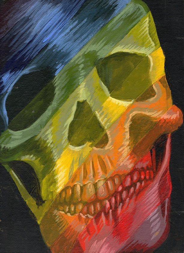
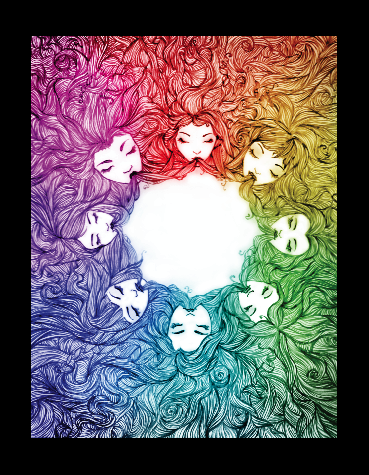
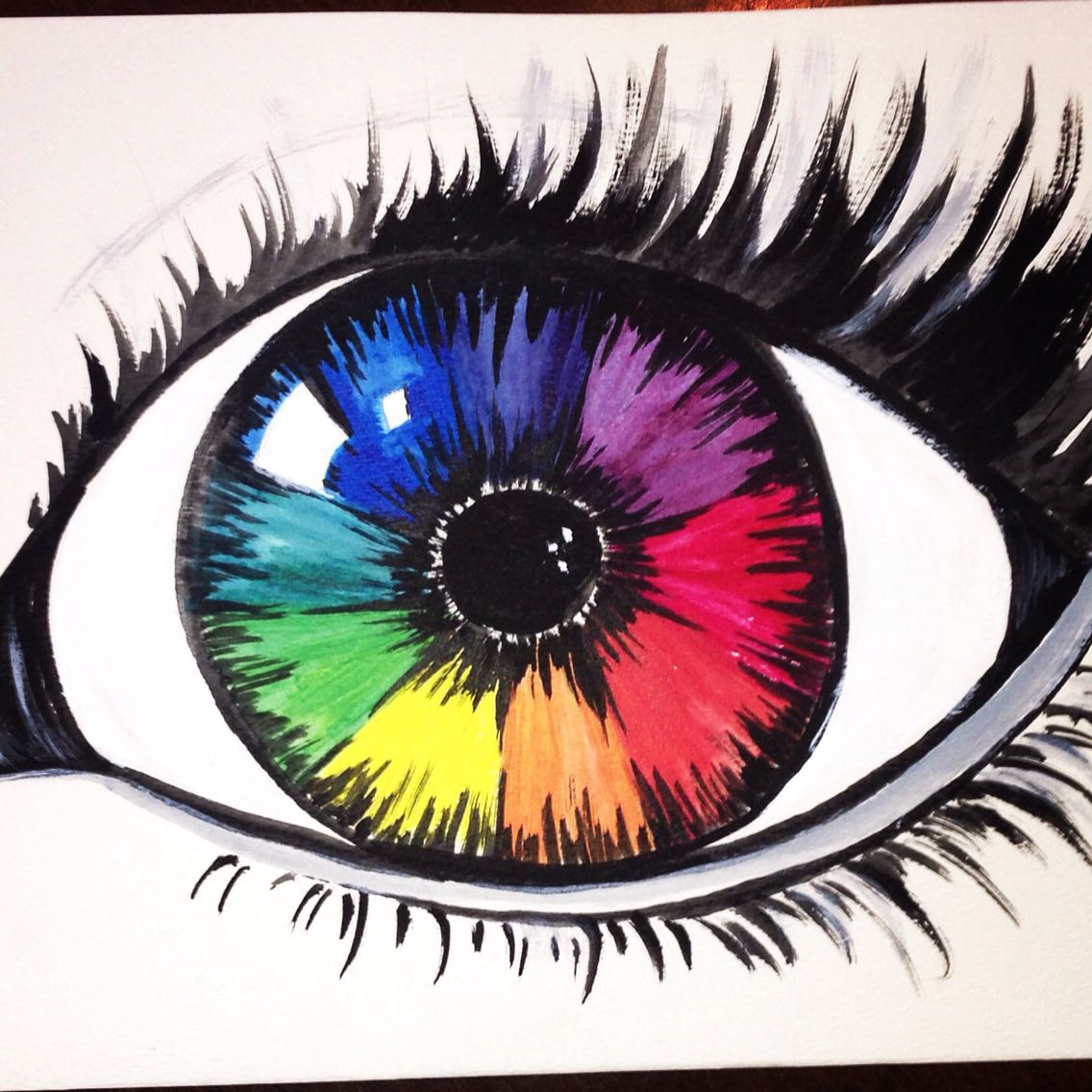
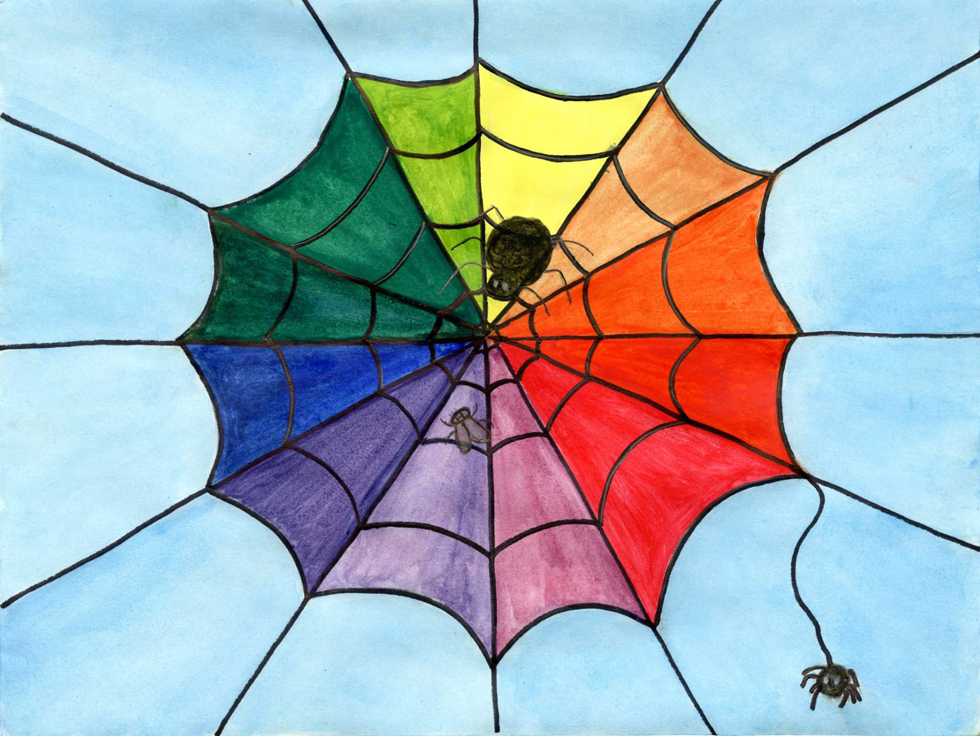
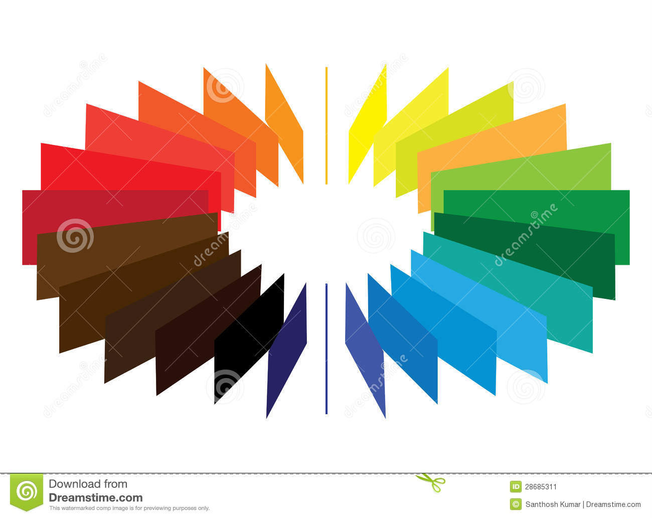
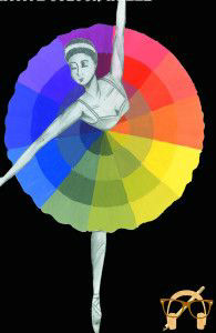
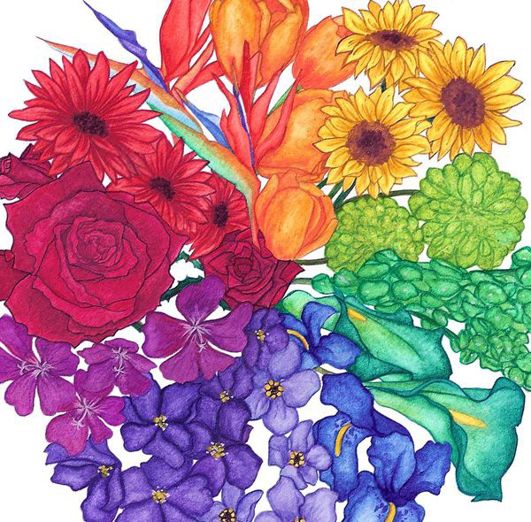
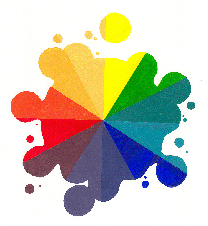
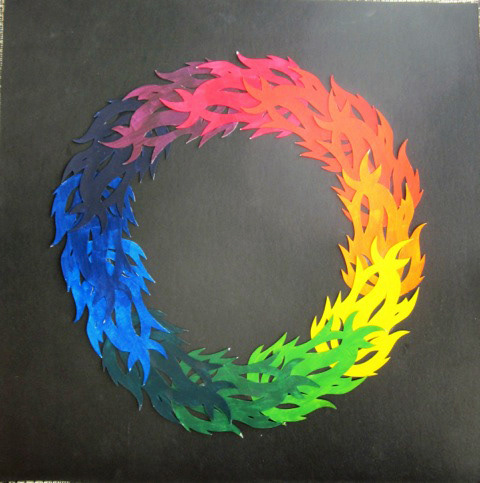
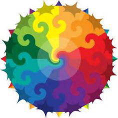
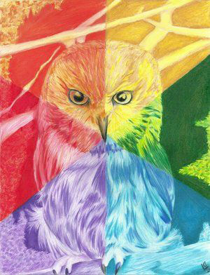
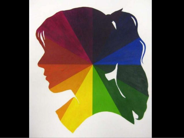
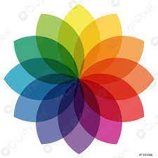
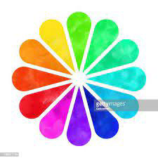
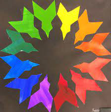
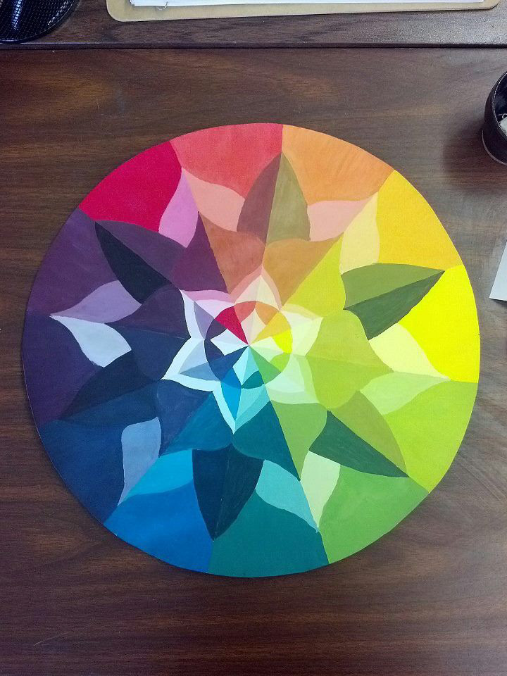
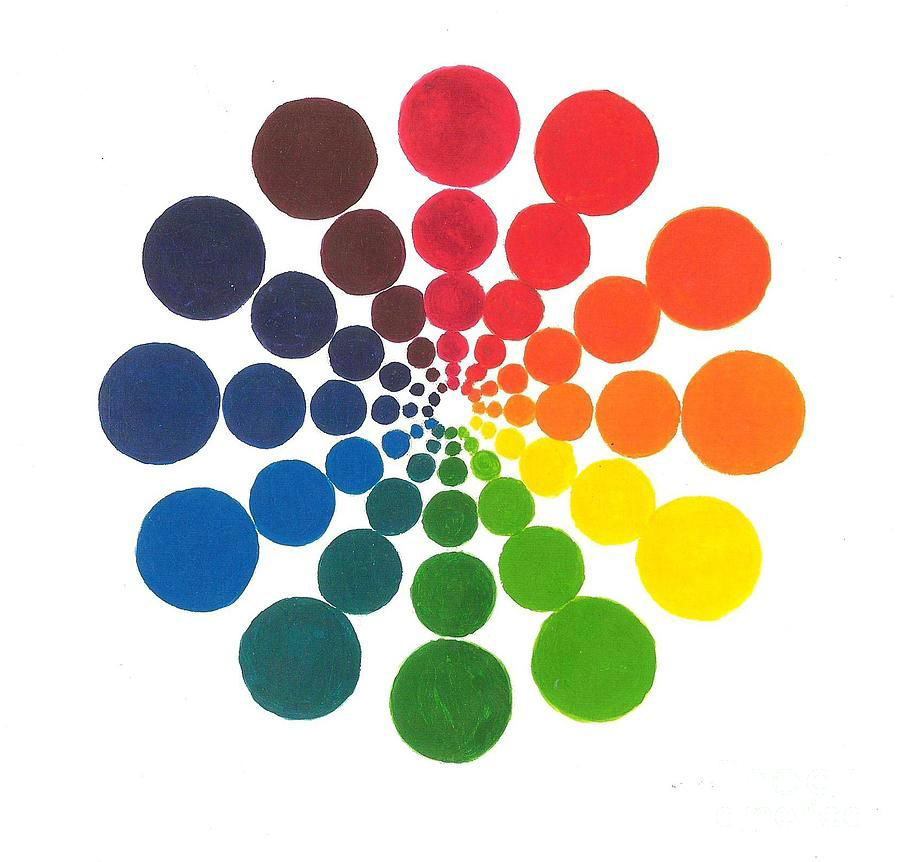
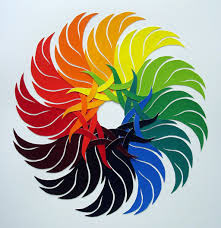
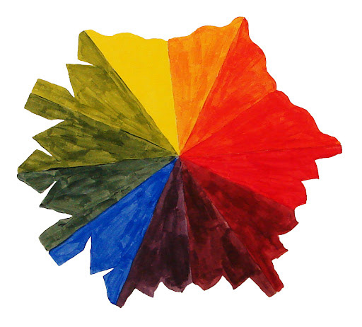
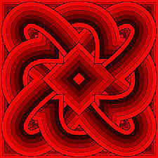
Creative Color Wheel Examples

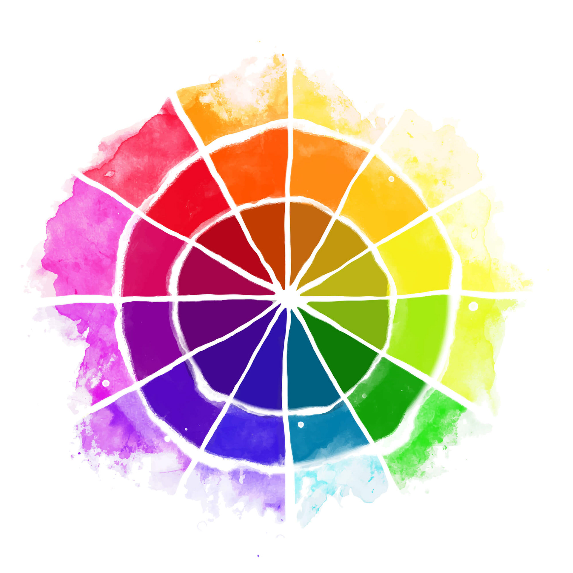


The Color Wheel consists of:
3 Primary Colors
Red, Yellow, Blue
3 Secondary Colors
(colors created when primary colors are mixed)
Green, Orange, Purple / Violet
6 Tertiary Colors-
(colors made from primary and secondary colors)
Blue-Green, Yellow-Green, Yellow-Orange, Red-Orange, Red-Purple, and Blue-Purple
Color Schemes
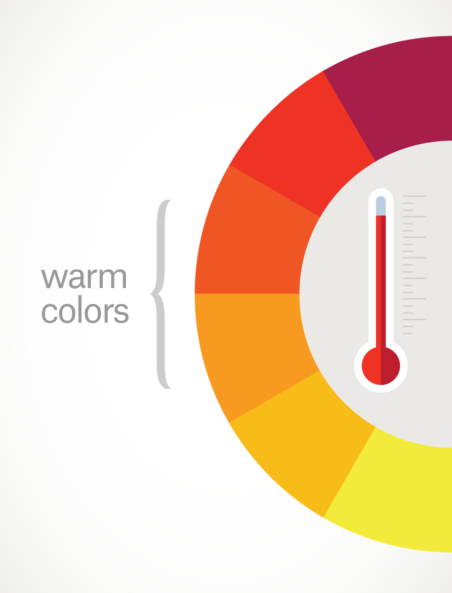
'Warm' and 'Cool' Colors
Draw a line through the center of the wheel, and you’ll separate the warm colors (reds, oranges, yellows) from cool colors (blues, greens, purples).

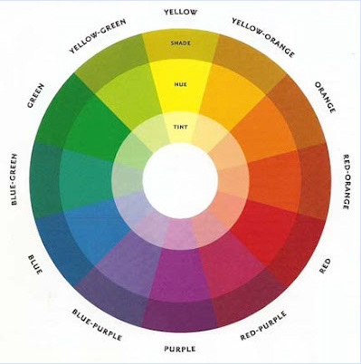
Hues, Tints, Shades, and Tones
What's the difference between a Color and a Hue? Most people, even the pros, get confused about this. The word Color is a general term. It refers to all the variations we see, even white or gray.
If you look at the Basic Primary Color Wheel you'll notice there are 3 separate bands circling the center. There should actually be a 4th called Tones as you'll see below.
Most Color Wheels only show bright colors which can create confusion. It's not always easy to see that every color, even black, has a Primary Color as its root.
Every individual color on the Basic Color Wheel can be altered in 3 ways by Tinting, Shading, or Toning. And that's before we even think about mixing 2 colors together.
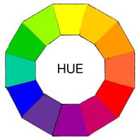
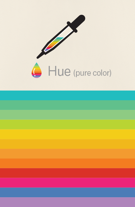
HUES
These are the purest and brightest colors. They form the full spectrum of colors which progress around the Primary Color Wheel in gradual increments.
These are the purest and brightest colors. They form the full spectrum of colors which progress around the Primary Color Wheel in gradual increments.
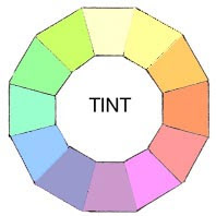
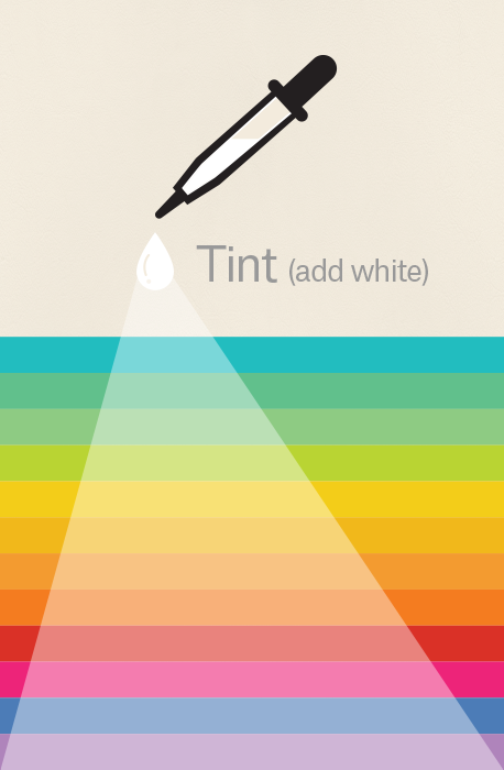
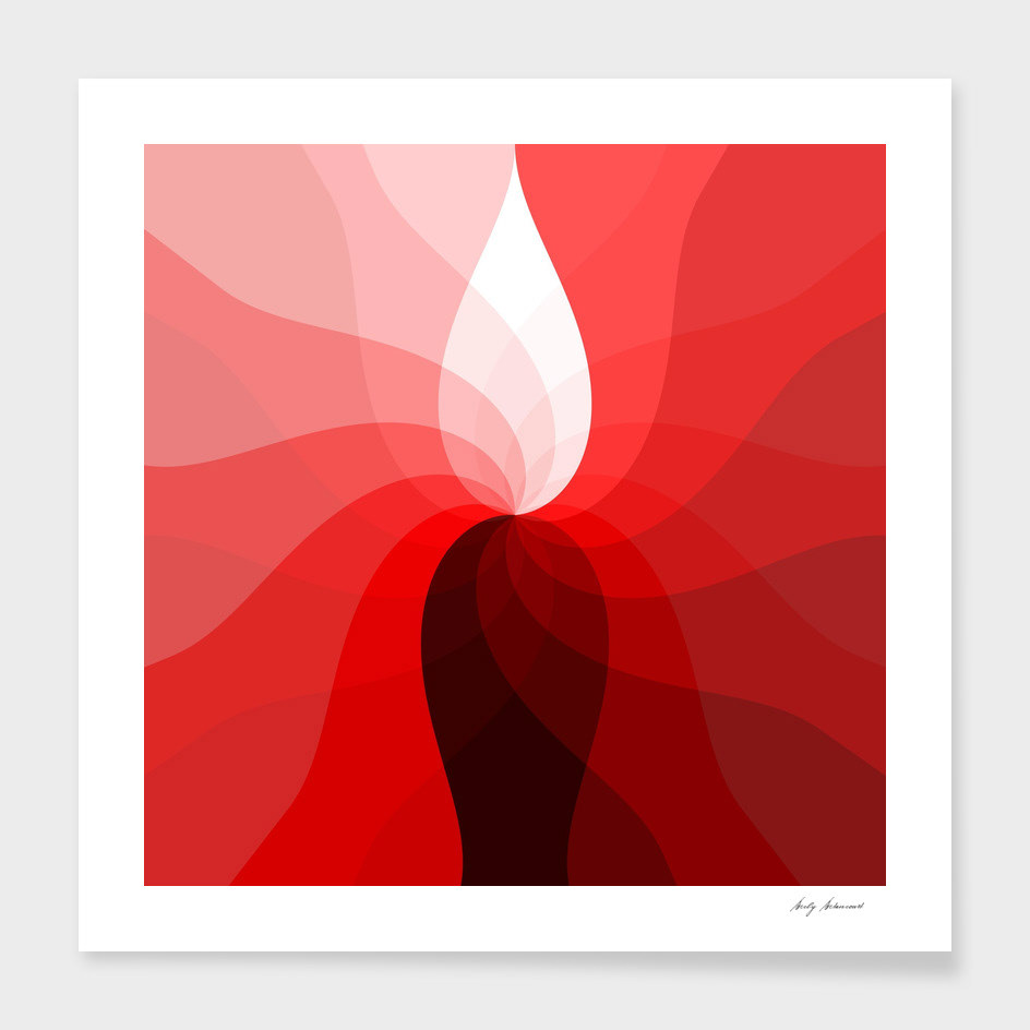
TINTS
A Tint is sometimes called a Pastel. It's simply any color with white added.
A Tint is sometimes called a Pastel. It's simply any color with white added.
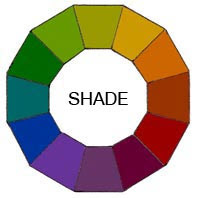
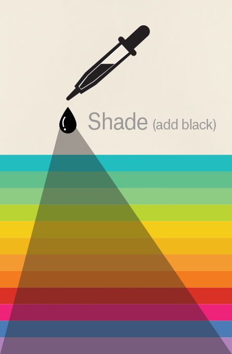
SHADES
A Shade is simply any color with black added.
A Shade is simply any color with black added.
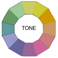
TONES
A Tone is created by adding both White and Black. Any color that is "greyed down" is considered a Tone
A Tone is created by adding both White and Black. Any color that is "greyed down" is considered a Tone
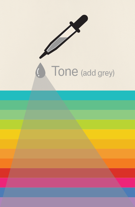
Simply put, tints, tones, and shades are variations of hues, or colors, on the color wheel. A tint is a hue to which white has been added. For example, red + white = pink. A shade is a hue to which black has been added. For example, red + black = burgundy. Finally, a tone is a color to which black and white (or grey) have been added. This darkens the original hue while making the color appear more subtle and less intense.
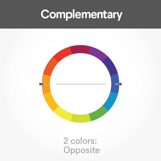
Complementary colors
Complementary colors are opposites on the color wheel—red and green, for example.
Because there’s a sharp contrast between the two colors, they can really make imagery pop, but overusing them can get tiresome. Think of any shopping mall in December. That being said, using a complementary color scheme in your business marketing offers sharp contrast and clear differentiation between images

Analogous colors
Analogous colors sit next to one another on the color wheel—red, orange and yellow, for example. When creating an analogous color scheme, one color will dominate, one will support and another will accent.
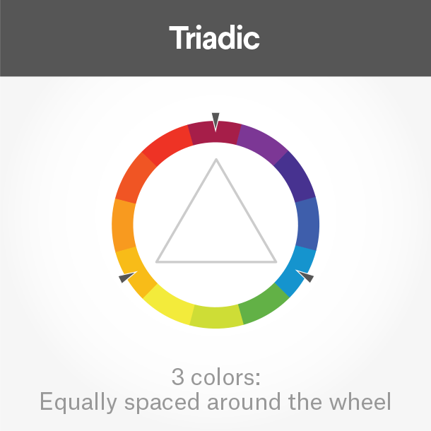
Triadic colors
Triadic colors are evenly spaced around the color wheel and tend to be very bright and dynamic.
Using a triadic color scheme creates visual contrast and harmony simultaneously, making each item stand out while making the overall image pop.

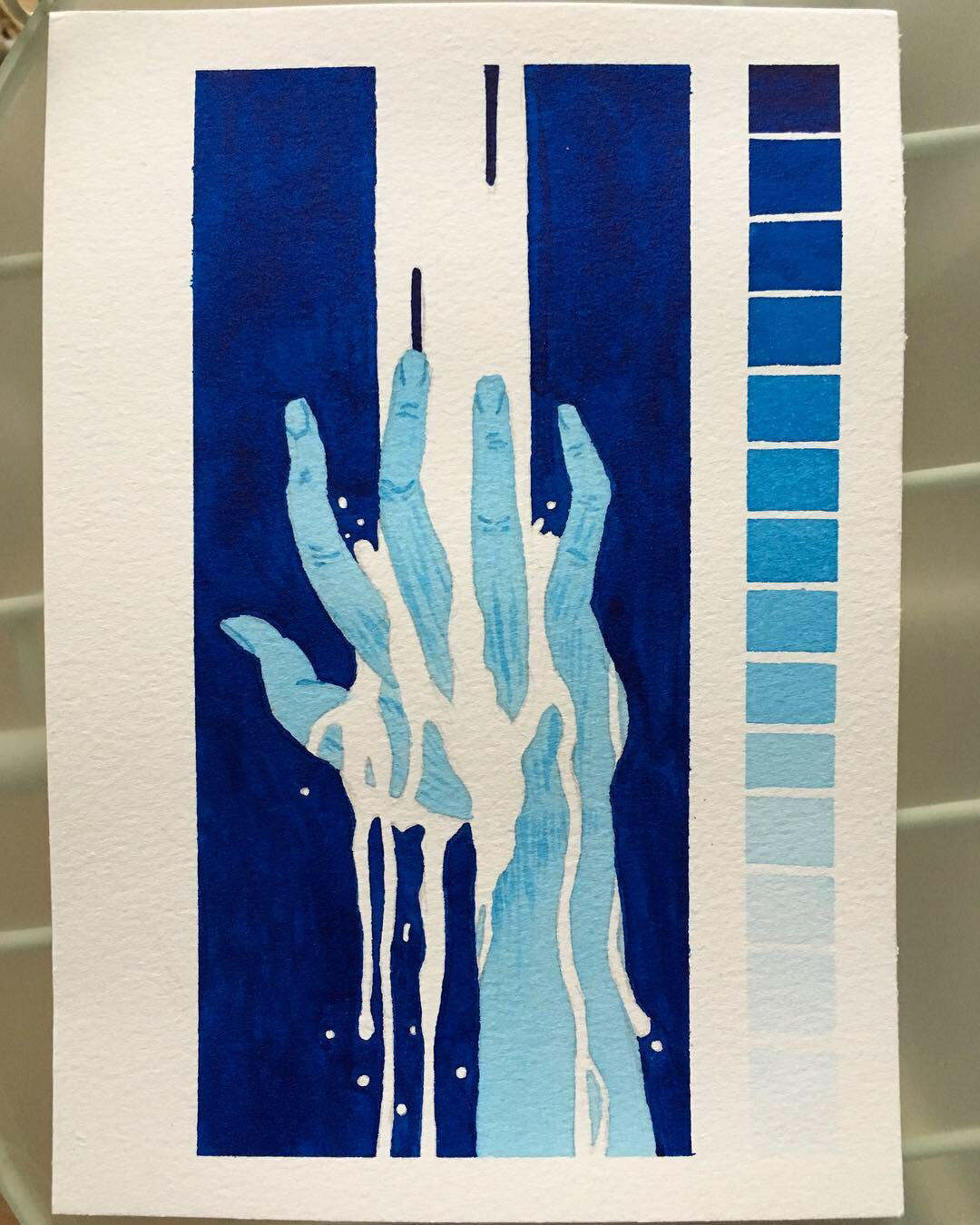
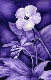
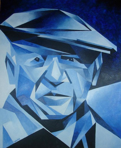
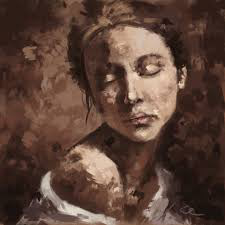
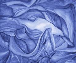
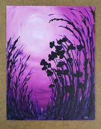
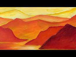
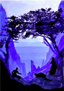
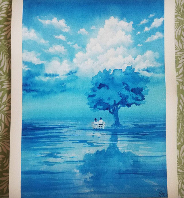
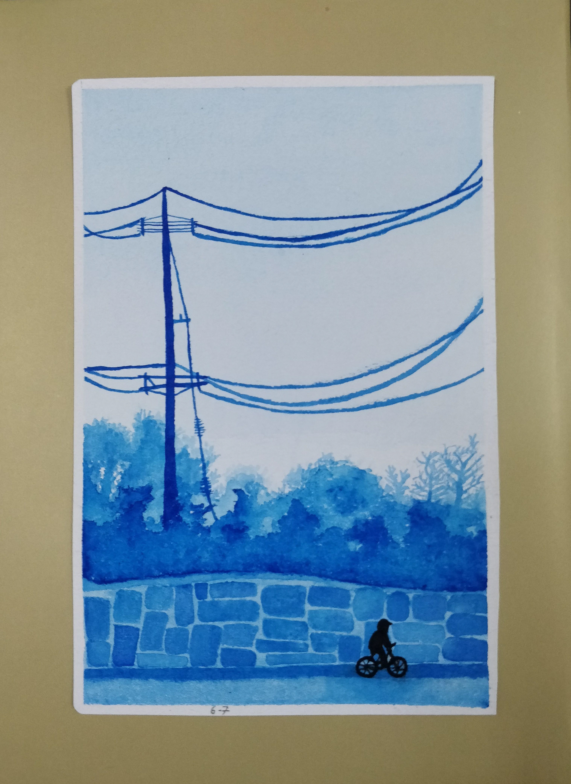
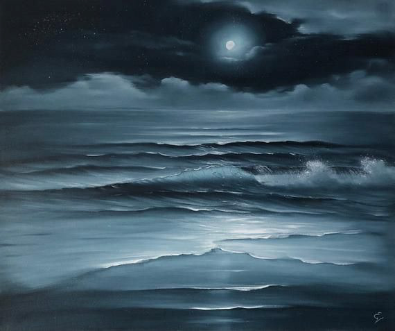
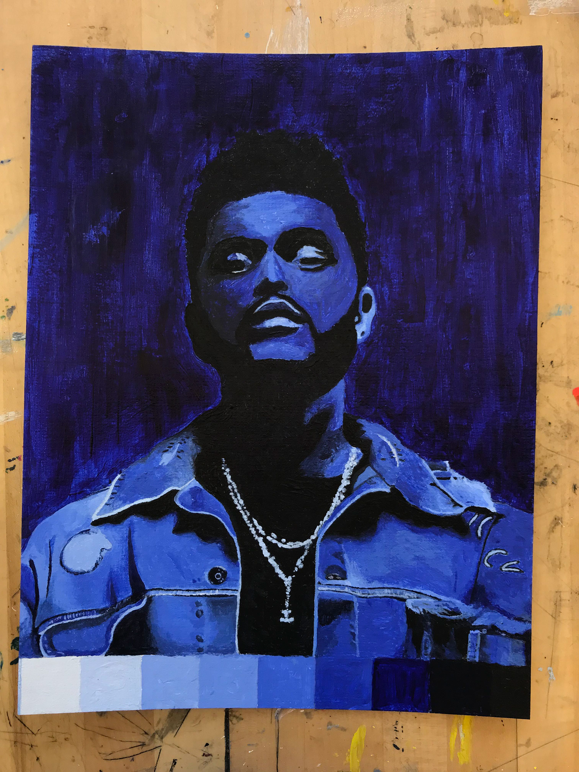
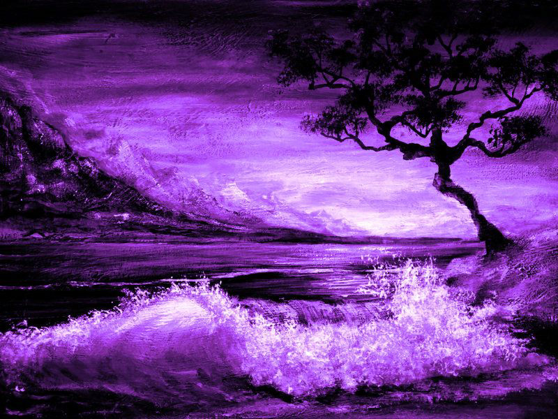
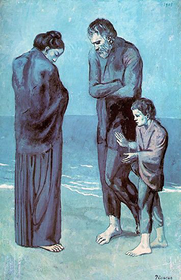
Monochromatic Painting
Monochromatic paintings help artists understand how light and colors can create shapes within a composition. Painting in different hues, tints, tones, and shades of the same color will hone your observation skills, aiding you in identifying colors in future paintings. It will also help you identify brightness and contrast.
Here are some points on monochromatic painting to help you understand how to paint in monochrome with acrylics, better.
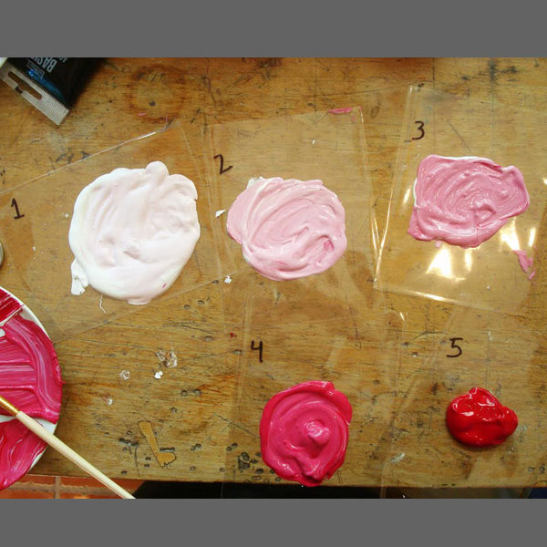
Step 1: The five gradients rule
Pick the color you would like to use for your monochromatic painting. You will be using this color to create 7 variations (tints, hue, shades, and tones) for your artwork.
Make 7 small portions of this color separately to create different gradients. Ensure that each of the gradients is different.

Step 2: Choosing your reference image
Pick a reference image that has a fair amount of contrast. A good way to check this is to digitally change the image to greyscale (black and white). If in the black and white version of the image (you can clearly make out a variety of tines, hues, tones, and shades) then the image has good contrast. If it all looks the same, then pick another image.
Step 3: Draw or print out the image

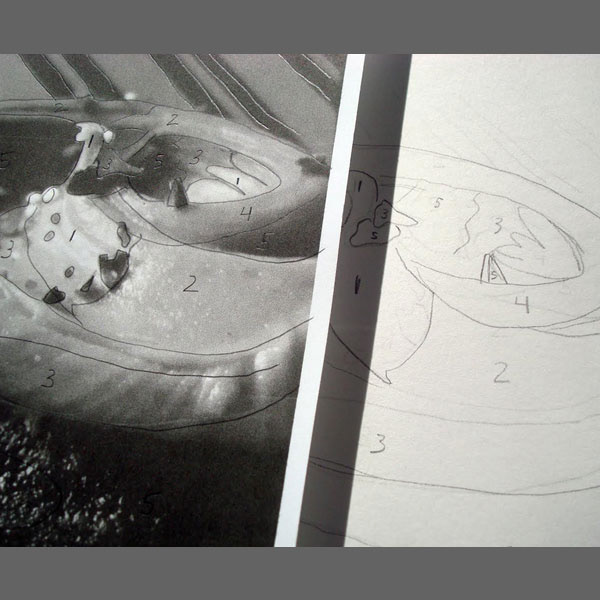
Step 4: Trace (for printout) using tracing paper, or draw (for drawing) the distinct blocks of tints hues, shades, and tones in the image. Give each a number from 1 to 7 and write down the number based on how dark or light you want the color to be.
Step 5: Transfer your image from your sketchbook to your canvas (or wood panel, record, etc.)
Step 6: Paint each large section of your image using your "distinct blocks" reference image (Step 4).
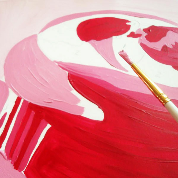
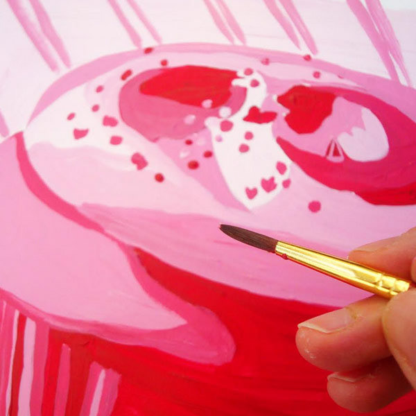
Step 7: Once you have completed filling in the large sections, add the detail areas using your reference image as a guide.
Don't Shy Away from adding a second coat of paint to areas if the
numbers still show through.
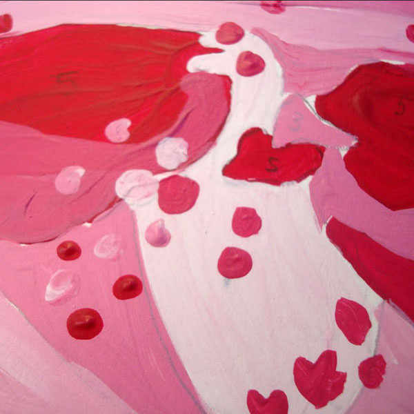
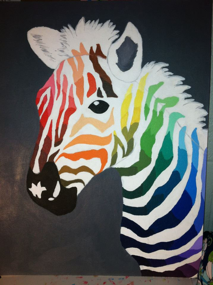
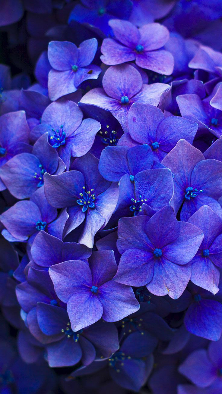
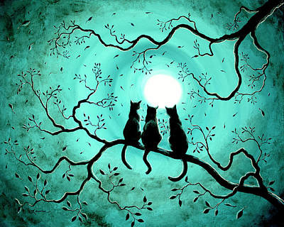
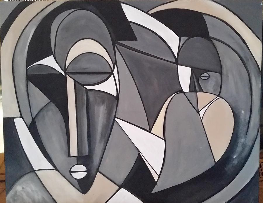
Monochromatic Painting Examples


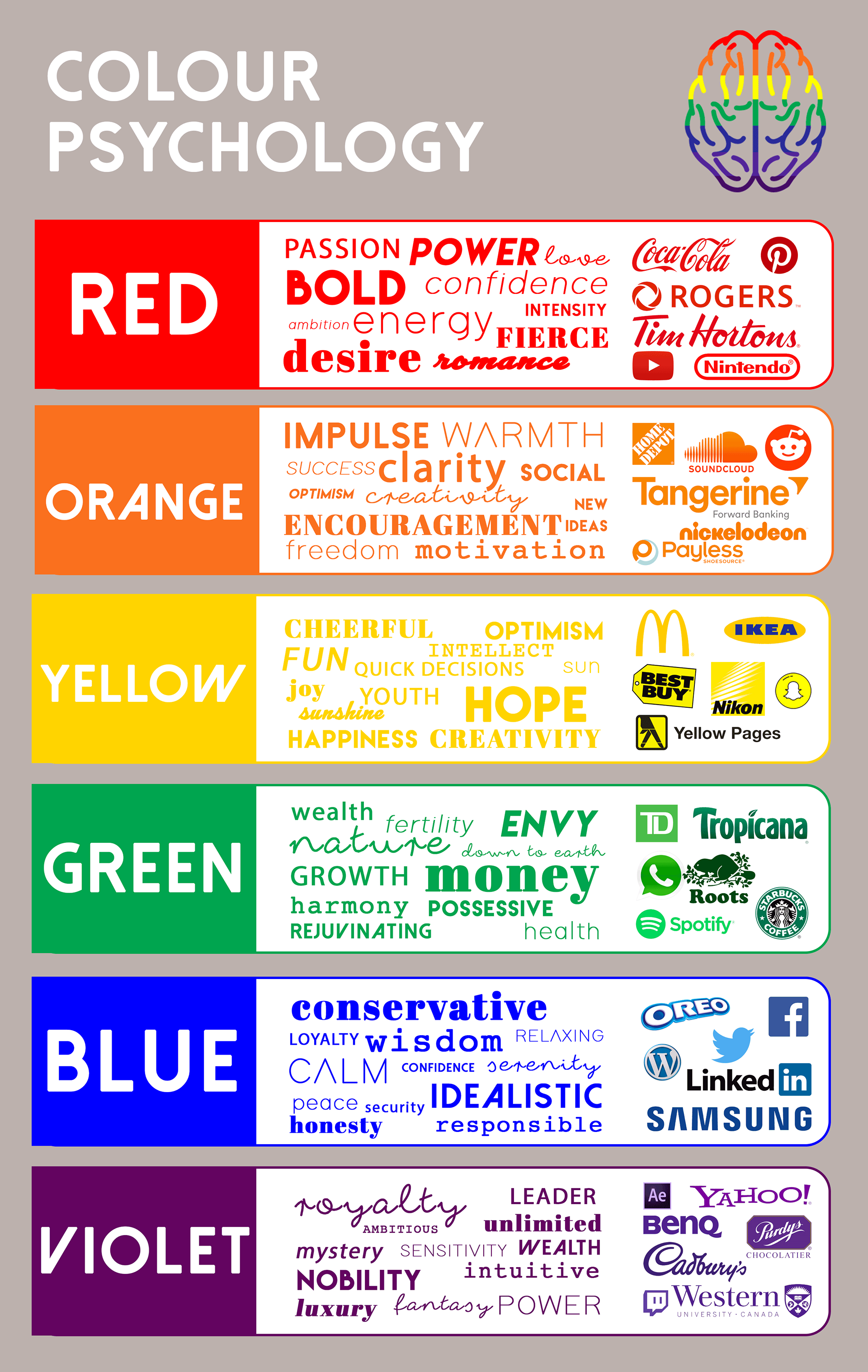
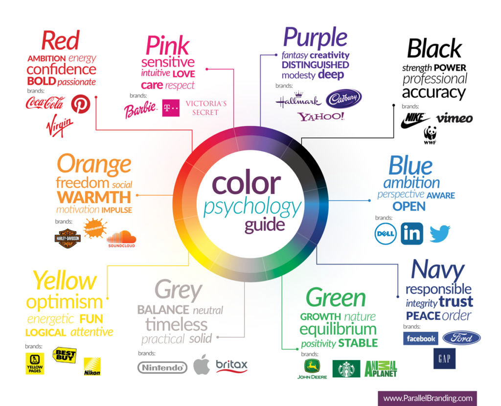
Color Psychology